Hello, I am Daniel Nagaets, the founder of render.camp and co-founder of Fortes Vision.

Currently, I have 18 years of experience in commercial architectural visualization. My journey started as a freelancer, then I built a small company, and then I founded companies from scratch, and was engaged in partnerships.

For over 10 years now, I have been imparting my knowledge to students in the Professional Visualization course, teaching them how to create professional architectural visualizations.

In this book, I have compiled everything I consider essential and unspoken about architectural visualization. It covers creativity and technology, provides useful links and tips, delves into composition and optics, and many other topics.

Not overly long, but sufficiently detailed.

If you read this book carefully and follow my advice, you will undoubtedly produce not only visually appealing images but also enhance the quality and speed of your projects. More importantly, your experience with projects will become enjoyable, understandable, and predictable for both you and your clients.

Enjoy your reading.

Preface

Commercial architectural visualization is a blend of four components: Architecture, Fine Art, and 3D, all multiplied by a Commercial task. Understanding this, breaking it down into its components, and honing skills in each of these areas can significantly ease the path of development in our profession. Starting with the most complex aspect, it's impossible to say "I have learned Architecture or Design." It's an endless process that includes knowledge of everything about everything: physics with the properties of materials and light, proportions and rhythms, Neufert's ergonomics, and an understanding of urban development, among many other things.

Just imagine trips with a camera for 3-4 days to iSaloni. Imagine Italy, Milan, spring, warmth – all legally because you're at a professional exhibition and conferences improving your visualization skills.

Fine Art sounds very romantic. Art, the golden ratio, the Renaissance. But we are pursuing our commercial goals. So, it makes sense to draw from the experience of the world - the vast crowd of people who, over the last 40,000 years, have progressed from the first cave paintings through Leonardo Da Vinci or Canaletto (top-notch arch viz artists) to modern photographers and videographers - everything they went through and realized about images can and should be taken and used.

The most foolish and primitive thing we can do is to simply ignore tens of thousands of years of experience and, in every project, seeking a good camera position - choose a front view with a high clipping plane. The idea is simple - an image on a flat surface can evoke emotions and therefore influence human decisions because emotions rule the world, including sales. And humanity already has this experience.

All knowledge about 3D is just a technical skill. Most importantly, one should not have excessive expectations of it. It's no more than the ability to type on a keyboard for a writer. Of course, it's important to be able to do it. But a beautiful and harmonious story is born in the head, in the imagination, not between fingers and buttons.

What is commercial visualization

Commercial architectural visualization, or commercial archviz, encompasses images, animations, or panoramas that serve a specific commercial objective for the client.

The formula is straightforward: your best worked-out visualization techniques that meet specific business needs.

Of course, you should have well-practiced visualization techniques, composition skills, and a collection of assets. It's wise to practice these in advance, like training before a competition. At the start of a project, it's crucial to brief the client to ensure a clear understanding of the task at hand.

And certainly, the renders must be attractive — otherwise, no one would buy an apartment, a house, or invest in construction. However, they shouldn't be creative in the sense of "sooooo beautiful but incomprehensible."

A deep understanding of the tasks associated with the images you're commissioned to create will significantly simplify the entire project, making it faster and more transparent for both the artist or studio and the client.

What we provide to the client

From the very beginning of working on any project, it's crucial to think about the specific number of images we will send at the end. The goal of the project is precisely these 5-10-20 frames, not just a developed model from which to later select beautiful shots.

Why mention this? Because from the start of the project, at every stage, you should be moving towards its conclusion. During the client briefing stage, you can already establish what these shots should convey by asking: "What is important to you?"

If your client is an interior designer, then you definitely have a layout.
You can directly mark the important areas that the client emphasized on it.
The next step is to find the best obvious camera position considering the "90-Degree Rule".
Notice how the goal of each shot becomes a specific area of the interior. This approach makes the frame easy to read and the project as a whole understandable, which is definitely beneficial for commercial visualization.

To showcase the living room area, we'll likely need to use clipping, and perhaps move a wall, just as we would for the bedroom. For a shot focusing on a round table, hiding an island or using clipping might be necessary.

But maybe you disagree with these ideas and have some of your own. You know what happened? We've moved from blindly searching to solving a specific problem. And this saves more project execution time than even a computer that's twice as powerful.

Moreover, by understanding what you'll show in each shot, you can select references for each, significantly easing your workload.

The same goes for architecture; you can also anticipate camera positions with general plans and detail shots that are potentially interesting. And you can set the lighting from the most advantageous side, as I demonstrated in this lesson:
You don't need to be a genius for this, just look at the plan or model and understand what's there.

Of course, if you've never used this technique, it might seem that everything can still change, and we don't know what the scene will look like. Not exactly. If the task is clear, there aren't that many possible solutions. I'll prove this to you in the section on "Worked-out visualization techniques."

Artistic renders vs. commercial

The most crucial thing is to distinguish between creative works and commercial projects. Please don't read this as a divide between beautiful and not beautiful, or artistic versus non-artistic. A close analogy is the difference between a concept car and its mass-produced design. What designers develop as a concept and what goes into production differ because, beyond design, there are factors like ergonomics, budget, market expectations with its purchasing power, cultural and artistic habits and customs of the area where the car will be sold, and of course, the subjective preferences of our client.

After all, we all like sleek sports cars, but we end up buying more versatile vehicles, which are also stylish, beautiful, and comfortable. The same goes for architectural visualization.

Creative work is about learning to do something new, practicing techniques, or bringing to the screen what has matured in our imagination. It might even involve testing some artistic hypotheses.

But "creative" doesn't necessarily mean something wildly outlandish and impractical; it's a place for practice, which can take any form.

It's also a time and place for growth and development. For example, if you've outgrown your current projects and seek development, you can create several creative projects that you aspire to and share them with the world.

Commercial work
involves using a project execution scheme we've already perfected, something we've tested and can deliver to the client with predictable timing and quality.

That's why it's important to choose the style and essence of the work you want to engage in, learn to do it better than anyone else in the world, and sell it at a premium by taking on as much responsibility as the client is willing to give you.

Types of commercial archviz

In our team, we break down commercial archviz into three main types or tasks:
·
Initial investment search
·
Architectural visualization
·
Marketing materials
Initial investment search
This is arguably the most challenging and creative task. Imagine yourself in your client’s shoes. You have a business idea, say, to build a shopping complex. You've estimated the costs, drafted a business plan, ordered a concept design from an architect, and now you need compelling images to present your project and attract investments. Everything might change, and it might not even work out, which is why you need irresistible images where the precision of details doesn’t really matter. Artists often shrug at such orders, saying, "without a brief, the result is a mystery." It's essential to differentiate between the lack of technical information on a real project and a concept.
Architectural visualization
The most common type of project that might overlap with the other two tasks. Its goals are the same for both interiors and architecture. It’s best described as a confirmation of architecture or interior design.

These images will be used to confirm everything shown in the frame — the place, materials, dimensions, and list of things to buy and build. So, the keyword here is accuracy.
Marketing Materials
These are images and animations used in advertising. The most significant difference lies in the frame sizes and the speed of content consumption.

Imagine yourself as the person who will see it. Where will you see it? Somewhere on social media, in a chat, on a website but in 86% of cases, on a smartphone in portrait mode, just scrolling through the feed. Some clients understand this and specifically order both vertical and horizontal shots with space for a logo, a "submit request" button, etc., but some need this explained. This could be an added value you bring.

The speed of content consumption is directly related to how understandable your frames are. We scroll through feeds quickly. If a frame is clear and easy to “read,” the likelihood of your client's customer submitting a request is much higher. Consequently, your value to your client is also higher.

In my subjective opinion, the worst thing you can do with these stages is to reduce them all to one — Architectural visualization, thereby destroying the entire scope of imagination in the concept stage. After all, how else will humanity invent something new if not by dreaming? And all the artistry of marketing, because this stage determines what fills your social media feed.

Trained visualization techniques

Think of them as frame scenarios. For example, you specialize in visualizing interiors of apartments and houses. In every project, there's a bedroom with a bed... besides the bed, there are other elements, but the bed is a given. Why not master 2-3 shots focusing on the bed, to know exactly where to position the camera, how to angle the light, and pick your favorite bedding sets.

The same goes for kitchens, kitchen islands, offices, sofa and chair setups, bathrooms, and everything else that might be in the picture. It might seem like there are endless options, but if you start listing them, you'll find that there are fewer than 10 types of tasks for residential interiors. Each can be described, with the best composition options identified and learned, repeating the same camera position, lighting direction, and color and compositional accents.

How?

It's quite simple — pick a theme, say, a kitchen island. Head over to Pinterest, Design, or ArchDaily, and download all the coolest images on this theme. Download a lot. Hundreds. Save them in a separate folder named References - Kitchen Island. After downloading, clean it up by removing anything that got in by accident or you've changed your mind about. Next, sort by composition type. You'll see that there aren't that many composition typologies for such a task.
I've found five composition typologies for this task:
·
Camera views along the island
·
The island at a three-quarter angle to the camera
·
A partial three-quarter view
·
A frontal shot of the island
·
And, as a specific example - half of a frontal shot of the island
Done. Now, based on these typologies for solving compositional tasks, we know how we can tackle the "show the kitchen island" task depending on the layout. That is, where to place the camera and how to light the frame.

The principle is simple. We take a task, find the best examples that already exist in the world, typologize them, and then do the same or better.

Project pipeline

A project pipeline is a step-by-step system outlining the sequence of tasks. It's vital to present this to your client at the beginning, highlighting that this is how you operate. Each checkpoint should be tied to a specific date, with allocated time for client feedback.
1. Project Discovery
1-2 meetings. This stage involves briefing the client, gathering all relevant information such as references, drawings, models, plans, explanations, and anything else that could be useful for your project.
2. Scene Setup
This stage can take up to 50% of the project time. It involves modeling all scene models, searching, checking, and uploading ready-made models into the scene.It's crucial to show the outcome of this stage to the client for model verification. This should be a render in 2-3K resolution on the longer side, in gray material with reflection and HDRI lighting with foggy illumination.Before moving to the General Feeling stage, clean up the scene by removing unused objects, organizing models into layers, and cleaning up with the Prune Scene plugin.
3. General Feeling
This stage aims to capture the main emotion of future frames, based on the briefing assignment. It involves embodying composition tasks in the project, namely camera positions, lighting settings, and main light adjustments.
This stage can also be processed with AI and turned into a reference.
We always show the outcome of this stage to the client.
4. Shaders
Ideally, after approving the General Feeling, we can move on to working with shaders.
5. Animation and postproduction.
Many projects culminate in animation, so don't bank on extensive Photoshop work. It's essential to discuss this with the client during the briefing, as it may influence the choice of rendering engine, project timeline, and price due to rendering farm costs.

Primarily this involves animated camera work, with people, vehicles, and plants being secondary. If the video is no longer than 30 seconds, we don't need a complex script, and this stage can be quickly completed.
If a longer video is needed, it will require a script and a director, which I'll discuss in the section "All you've ever wanted to ask about animation but felt too shy to".

How to brief a client

It's crucial to extract primary information from clients and save it in a text file accessible to all project participants. It's important to understand the client's true task, not just nominally. Ask why they need the images specifically, what they will do with them, and when.
Here's what you need to know:
·
Who the client is.
·
Who the decision-maker is.
·
What images need to be created.
·
The project's purpose.
·
List of areas to be showcased.
·
Who are the images for. Who is our client's client.
·
The purpose of the images, where they will be used specifically. Preferably in a list.
·
Frame proportions and resolution.
·
What are the images about, what exactly needs to be conveyed.
·
Describe the scene happening in the image. Even if it's just the time of day or year, weather.
·
Deadline. Date and time.
·
Deadline description. What happens on this date.
·
Is animation planned?
·
Describe the images. What should their mood be like? Preferably with examples. Are there any references you rely on?
·
Should people be present? If yes, describe the event, what happens in the frame, and the typology and number of people.
Example —  parents taking their children to school in the morning, children in blue uniforms with a logo on the back, parents aged 30-35 dressed in business style.
·
Should vehicles be present? If yes, describe the class, color, quantity. (The answer "to create a specific impression" is also valid, then just find or generate a reference that matches this task)
Plants:
·
Landscape design
·
Or description of typical/presumed/desired plants
Materials:
·
Interior finish passport
·
Exterior material explanations
·
If not available — mood board or references with textual description

Project presentation

The main idea is that a project needs to be presented. Simply sending over images won’t cut it. You have to showcase it. We use the service conceptboard.com. We just set up a Google Meets call and, during the meeting, sent a link to the project on ConceptBoard. There, each participant can closely examine the image, draw something on it, leave comments, and track changes for each picture.
It’s crucial that while the client is reviewing the work, you shouldn’t leave them in silence. You need to guide their focus, presenting your solutions based on the information from the brief.

For example: “During the briefing, we agreed that these areas are the most important for the project, which is why we created such compositions and chose lighting that best showcases this area and its function.

The most important phrase here is “which is why.”

The structure for presenting each frame, and even solutions within the frame, goes like this:
Brief’s task + which is why + your solution
It makes sense to add that your solutions should match the task. And in case it's impossible to fulfill this task, this should be discussed with the client to find a mutual solution.

What should the model be like?

It's worth mentioning that every artist should have experience in modeling. They should be able to create any piece of furniture of medium complexity and unfold it, but should avoid this work by all means possible.

Here's a common example of a good and bad model of the same chair:
Nowadays, there are numerous websites offering models for a small fee. Some can even be obtained for free, officially. Some furniture factories, caring about their sales, commission professional modelers to create models of their furniture and allow downloading them for free on their websites, sometimes requiring registration.

The total cost of models for a project rarely exceeds 10% of the project's cost. Include these expenses in the project's price.

What should the scene be like?

·
Use layers. Put a serial number at the beginning of each layer's name because if you don't, the layers will be sorted alphabetically, and you won't be able to find anything.
I use three-digit numbers. Technical layers first, starting with 100. Then, the main geometry, like layers 200 and 300, for example, the building and the environment, and so forth.
·
Windows detailed. Even if you need super minimalist windows, they still have detail. Window frames looking like boxes always appear very poor.
·
All window glasses in the project should be placed in a separate layer. The glass thickness is 4mm.
·
Everything that is essentially wooden planks should be prepared for multi-scatter. It's also important that all planks are in real sizes; for parquet and laminate, this is on average 2000mm by 200mm. Because you won't find even 4-meter planks when working with textures. If you need to cover a large area with planks - think about where you can have seams.
·
Remove all decor. If you downloaded a sofa model you needed, but it came with a table, books, bottles, beads, and glasses, remove them. Decor should be a deliberate element of composition, accentuating the viewer's attention on the dominant element rather than creating visual noise.
·
Remove all materials and textures in your scene.
I know, it sounds scary. But if you want to achieve truly captivating results, you'll have to redo them from scratch anyway. Plus, scene loading, rendering, and viewport work will become much faster.

There's only one exception — scanned models for which only their own texture is suitable. The material, in this case, will still need to be redone, but you can keep the texture in the material editor.
·
The scene should be at the origin point.
·
The ground floor/sole floor of the main building should be at the 0.000 level on the Z-axis.
·
Prune scene. Use this plugin to clean the scene.
·
Devise a system of names and numbering for projects. All project files should be named with the project number and name.
Inside each project, there will most often be the same folders. Create them right away and name them the same for all projects.
In the folder with renders, it's better to have subfolders named with dates and a short description of what's inside:
Never save renders with the name finalfinalfinal_39912.jpg on the desktop. A render's name should include the project number, project name, project stage, and the number of this specific render in that stage.

(XXX_Name Of Project_Stage_01_001)

About the decor

I have a rather negative attitude towards decor that is unnecessary for the composition, especially when it creates informational noise.

Instead of the word "decor," I’d use "la nature morte" (still life) This is a composition of plants, fruits, dishes, or fabric that enhances the meaning of the frame, emphasizes the dominant feature, and adds life to it.

When creating such a composition of decor in my frame, I imagine that I could even cut out this part and create a new frame that should look like a classic still life.

About the composition

Composition is a concept that combines the arrangement of objects in the frame, the light-shadow composition, and the coloristic composition into one harmonious narrative.

The dry formula looks like this:

Composition = Position of objects + Light and shadow + Color scheme

All these elements of composition work together and fulfill the common task - to tell a part of the project's story.

Yes, imagine that your entire project is a book, then this frame is a chapter titled "Once upon a time, there was a chair."

Treating each frame this way, clearing it of unnecessary informational chaff, will make it easier for you to create it, and for the viewer to understand it. Quick understanding is very important, as we live in a world of informational noise, and understandable frames are like a breath of fresh air. Therefore, they are more pleasant than others and comfortable to be with.

It's important to say that I by no means want to say that complex multi-component compositions don't have the right to exist. Of course, that's not true. It's the next level of an artist's skill to balance a large number of spots and volumes. If you can do this — my composition advice is definitely not for you. But if your daily work is not as good as the examples given — the advice is for you.

Lyrical retreat:

Composition can be light-shadow, coloristic, volumetric spatial… it's everything we have in the frame.

And also… a composition of flowers is a bouquet, a composition of fruits is still life, a composition of smells is a fragrance, the play of several instruments is a musical composition, a composition of clothes is a style or look, depending on which millennium you were born in :)

These concepts are united by one word - composition because it's a common word describing when several different entities look/listen/smell/feel good together — they harmonize.

So, we need to combine geometric shapes in the frame - a rectangular flat image, in such a way that they look good.

In the paragraph "What We Deliver to the Client," I wrote that we should understand at the early stages what each frame of the project will be about. That is, the purpose of a specific frame is clear to us - to show a single object or a composition of physical objects.

How to assemble them into a composition? How to arrange the objects themselves in space so that they are harmonious with each other? I could give a thousand pieces of advice here and find a thousand exceptions for each of them. So, I'll give a practical tip - find a reference. Seriously, just open Pinterest and ask it to show you. And it will show a lot, but you'll like something more. Do the same. And continue to use this method until your own compositions become better.

Next… How to place this object or group of objects in the frame? I have a pretty powerful tool for this. In the Viewport Configuration, I enable frames that leave approximately equal space around the perimeter of my frame, which is necessary so that the composition does not look cramped. I set the camera height at about one to one and a half meters from the floor. And I make sure that the object fits entirely within the frame. If it's a group of objects, it may be slightly wider.
Everything that falls into the foreground and background is context, I don't hide these objects, unless they critically prevent showing the dominant in the frame.
Are there other types of compositions? Of course, yes, I've already described them in the block "What are the worked-out techniques in visualization?" so I won't repeat myself.

But the position of objects in the frame is not the whole composition, there's also light-shadow composition and coloristic composition. And if you simply call them light and color, you might accidentally underestimate their importance. And sometimes, it's even more important than the position of objects in the frame.

First, light and shadow. Let's take this picture with a chair and get rid of the color so it doesn't interfere.
The chair is obviously the most contrast-rich place in the frame that makes sense. Yes, we also have stairs and a flower, but they obviously play a supporting role.

The goal is the same — to tell a chapter of this interior's book titled "Once upon a time, there was a chair." And it's quite obvious that a greater light-shadow contrast on this very chair will help focus attention on it.

But this doesn't mean that this part of the image needs to be made more contrasty; on the contrary, it's about toning down the rest. For instance, block out bright light spots that could be more contrasting compared to the dominant feature of the frame. Move some objects that can be moved if they are obstructing, like a chair, a coffee table, or a vase.

And the third tool — color composition. It has two parameters: first, how colors come together in a composition, meaning how they harmonize with each other, and second, how the dominant feature stands out.

Classic color theory suggests that up to three colors can coexist harmoniously within a single image. I agree with this and try to adhere to it, not going beyond these limits.

Just as an excessive number of objects can create shadow and light noise, an excessive number of colors can create color noise.

Color has two main parameters — value and saturation.

Value ranges from light to dark. Saturation ranges from gray to colorful.
There's a cool tool from Canva where you can upload any picture, and the program will show you the colors it's composed of.

Here's an example of harmony within a single color, where the entire coloristic solution is based on just tone and saturation.
Next, an example of harmony among three colors and their color palette.
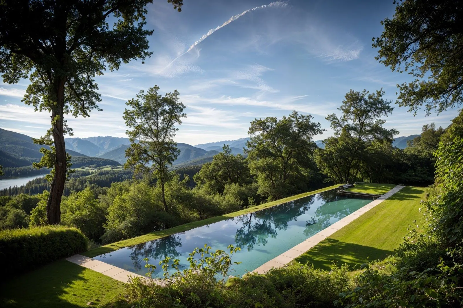
Why three and not two, as it might seem? Because the blue sky and turquoise water are, after all, two different colors, while all the greenery is made up of one color.

It's important to say — not all colors match; this is a highly debatable statement. And I feel I might get some flak for it. But this thought could save you a ton of time. Okay, you might ask, which ones do match? - Reference. Find references that impress you.

Note that the colors we see in palettes are often quite dark, and rightly so. A very big mistake is to make shaders too light; it deprives you of shadows. It's better to make the shader darker and increase the exposure.

In my work, I always use references for all stages of composition. I incorporate into my projects ideas for camera positions, light and shadow solutions, and harmonious color compositions. You should do the same.

Lighting in an interior

The first thing you should do is adjust the overcast weather lighting. If you need sunlight in the frame, you can add it later. Initially, you need to catch a balance of shadows.
I'll comment on this picture since everything about it is important.

1. The light is set up using an HDRI without the sun. Of course, rendering HDRI takes longer than Sky, but the details in the light color are much more realistic. A good free resource is Polyhaven; in the example, I used this map.

2. We're setting up a gray material specifically; it should not look white initially. This will give you beautiful deep shadows and solve the "gray ceiling" problem.

3. It will be much easier for you if the "exposure" parameter and the gray material you've set up in the material editor are approximately the same tone.

4. The material should have a reflectance set at about the level you see in the render. There are no materials without reflectance; all materials in the scene will have some reflection coefficient - so apply this.

5. HDRI can bring a lot of red into the scene, and the lighting looks slightly purple. I try to avoid this. If a slight HUE correction fixes it - great. If significant changes to the HDRI map are needed — better change the map.

6. Sometimes HDRI brings a lot of green from the lawn or forest. It's better to avoid this too. Change the map right away.

7. It's very important to get a Shadow Gap between all objects. No object should obviously intersect another, for example, a chair leg and the floor.

t seems that's all about light, but no. Now we're adjusting the overall color.
Imagine we mixed all the colors in the interior into one and got something average. It definitely won't be light and most often will be a bit warm. As a result, you need to achieve a delicate balance between the overall warm color of the material and the cold color of the light. Avoid tipping too much into either too warm or too cold.

Then we can divide the scene into two shaders. The one that will be significantly lighter, most often it's the ceiling and walls, and everything else.
But be careful. To actually divide. That is, the light should become lighter and the dark, darker, so that the overall balance remains the same.

The final stage of working with the composition is to give all surfaces the colors that are important to us in the scene by the same division.
If you need a sunny day in the frame, now is the time to add the sun, lower the exposure slightly, and add it.

Interior without windows

When talking about such spaces, we usually refer to bathrooms, basement bars, or night scenes of standard interiors.Yes, night means the absence of light, not its blue color.
The main difference is that we shouldn't have a light source that fills everything with light. Direct light from sources to areas that need to be illuminated. Try to do this harmoniously, not over-lighting some zones while forgetting about others.

And the main secret here is not to forget that light-shadow composition is a composition of light and shadow. That is, one light source should not overshadow the shadow cast by another light source.
I marked with red what not to do and with green what to do:)

Without the colors of materials and light sources, the lighting scheme of this interior looks like this
And now with the colors of materials and light.
And a few more examples done in the same technique, the lighting scheme with one material and the finished render.

Lighting in architecture

For architectural visualization, the most typical and expected mood is a Sunny Summer Day. 95% of commercial projects are done precisely in this style. I know that sticking to this one mood might not be interesting, but at the same time, I'm convinced that until your main "battle unit" is perfected to 200%, it's too early to diverge.

First off, the number one task is composition. Remember, it comprises three components: objects in the frame, light and shadow, and color scheme.

The same applies here; first, you need to determine the purpose and designation of each frame, set the cameras, and arrange the architecture and other human-made objects in the frame.
Regarding light, we need to learn to perceive three separate entities of light to be able to control and adjust them individually — the sun, the visible sky, and the sky that fills the shadows.

First, we set the sun. The sun's position should showcase the compositional dominant in the most advantageous way.
Most likely, you'll end up with an overexposed frame. The correct way to eliminate this is by lowering the frame's exposure, not by changing the sun multiplier. The thing is that this multiplier is very much linked to the sky multiplier. By default, the glow strength of the sun is 1, and the sky is also 1. So, if we want to create a hot sunny day, we simply raise the sun to 2-3-4, and lower the exposure parameter. This way, we'll know for sure that the sun multiplier is 2-3-4 times more intense than the sky multiplier.

Let's create the sky. And raise the sun multiplier to 3.
Now, we need to complete the light and shadow composition. So, we'll briefly divert to trees. After that, we continue editing the visible sky.

Why can't we do this before creating the sky? Simply because the black background is a huge black spot in our picture, which affects our vision. By leaving it, we'll just set up a composition suited to such a heavy spot, and by replacing it with a light sky afterwards, we'll just want to redo the composition.
Then we add the color of the greens, and if necessary, edit the exposure.
Next, we add grass and a shader with translucency. I use Forest Pack presets — great grass:). We edit the exposure a bit. Turn on Bloom & Glare.
Create a Tube of quite a large size, so that the camera and the building can fit into the central radius. And apply a volumetric material.
The last action is to find an HDRI with a suitable sky and apply it in the Direct Visibility Override.
Rotate it so that the sun looks harmonious in the render.
Adjust the brightness in the Output parameters block.
As a result, we predictably quickly obtain a beautiful stage that we call the General Feeling for architecture.

Optic effects

If you've created a wonderful image and want to add a bit of realism to it, optics is what you need.In this section, I include not only optics itself but also other effects borrowed from the real world. I use almost everything, always. But not as a replacement for a beautiful, realistic picture, but in addition to it.

DOF (Depth of Field). I always turn on this effect by default, and I don't need deep blurring of the foreground or background. A blur of 1-2 is enough so that the eyes don't see the excruciating sharpness of the render.

Motion Blur. If you have objects that stand out but aren't static for the frame, you can blur them. Look at the bush in the lower right.
Aerial Perspective or FOG. Essentially, this is the same effect with different intensity — moisture in the air. It's also the reason God Rays appear under certain circumstances. I actually don't use this object just because I can't find a harmonious application for it. In my opinion, this effect is so captivating that it distracts from the frame's tasks.

Vignette. Any lens creates this effect to some degree. Pay attention to it in references and in movies.

Bloom & Glare. Like Vignette, any lens creates this effect.

Sharpness. You love it, I know :) And I hardly ever use it, wrote "hardly" just to reserve the right to sometimes use it, but generally, I don't.

Artists often add it for two reasons — it seems the picture becomes more realistic due to a larger amount of detail in the minutiae. It's much better to actually add these details and render the picture in higher resolution. In reality, this effect creates realism.

The reason for such a mistaken belief is that the usual resolution of photographs is around 6000 pixels. Our eye, of course, doesn't work on such technology, but if we were to render a picture that would be comparable in detail to what our eyes see, the picture would be ten times larger.

So, instinctively, we want to add Sharpness to increase detail. Instead, we should be increasing the render's resolution. At least to something comparable to a camera's.

How to set up shaders

Before diving into settings, remember what color is and what the surface of a material is.

Color is reflected light. Reflected. Imagine that? Color is a reflection:) And what is texture in the real world? A molecular grid.

What do we do with this? Two simple but extremely important conclusions for setting up shaders.

1. Setting up any shader should start with reflectance. I'm not talking about excruciating glossiness, no, rather about the glossiness of typical matte surfaces like concrete or wood. Because in the real world, an object's ability to reflect is the reason we can see it.

2. The texture of any shader needs to be from approximately the same distance as in reality. Ideally, if the camera in the 3D world is 1 meter away from the object, then the texture we need is taken from this distance. 0.5 meters will also work, and 3 meters is fine. But from 10 meters, not so much.

A vivid example — have you tried to set up a lawn in a scene for a frame from human height and render it from a bird's-eye view? If yes, then you definitely know what I'm talking about. The lawn will be uniform and indistinct, whereas from the ground, it will look great.

Textures should be approximately for their distance.What I described above is the basic setup level of general feeling. Let's dive deeper into different groups of materials.

Wood, concrete, plaster, paint, brick, ceramics, and similar materials — first and foremost, set up reflections.
Only after that, add the diffuse map.
Bump is not needed. It will ruin the material. The only exception is genuinely textured surfaces that you could theoretically snag a nail on. Even then, displacement is much better.

Marble, granite, opaque plastic, wax, and other materials with subsurface light scattering.
1.
Scattered reflect
2.
Diffuse color
3.
Subsurface scattering light settings
·
Amount - 1.
·
Radius - 10-60mm.
·
Scatter color - such that it harmonizes with the color scheme of your frame.
4.
If you're going to apply a contrasting diffuse texture to this shader, for example, black and white marble, then apply it first in the Amount slot and adjust it.
5.
Now, the same texture in diffuse color.
Fabrics and woven materials

Indeed, they should start with reflectance, and then color follows.

Next, it becomes more interesting — we select a texture, preferably with a bump and, of course, seamless.

When applying diffuse, we'll need Falloff to ensure that the color of the material, where it's perpendicular to our view, appears darker, and where it's parallel, lighter. I assume this isn't news to you. But what might be really intriguing is the idea of replicating the fibers using any scatter method to achieve a similar effect.
The concept is straightforward, but it will require some experimentation. You need to model two types of fibers: shorter ones, which should be more abundant, and longer ones, which should be less so.

What can AI do?

Today is March 14, 2024.

Just a year ago, I did nothing with AI. Now, it's my working tool for every project, every image, and animation. Indeed, a tool. Let's leave behind the panic-stricken attitude that AI will take over the world. It won't. It's a cool, powerful tool, so ignoring it or, even worse, fearing it is foolish.

I'm convinced that those who are afraid to enter the profession now because "soon AI will come, and all artists will be unnecessary" will say the same in a few years and will be right in their way. Because it's already clear that the workflow of creating images is changing. But they are still made by people. The same skilled artists are passionate about archviz. Thanks to AI, people make better images, simpler, through different processes, but still by people. And I have no doubt that this will continue, though I'm sure the workflow will change further. Just as it has changed before AI with other progress phenomena.

Of course, AI won't do just anything for you. I mean that you need to have excellent architecture packaged in a harmonious frame. Okay, which AIs do I currently use as tools?

Stable Diffusion, Photoshop (GF), Magnific, Chat GPT.

What exactly do I do with their help?

In Stable Diffusion, I upload General Feeling and generate references. I present these references to the client.
Almost always, I present both pictures so that the client isn't scared by broken geometry and explain that the reference is about the emotion of the frame, and the render is about correct detailing.

I love upscalers like Magnific. Essentially, it understands what each part of the frame is about, finds its alternative in the world of photographs but in higher resolution, and assembles these puzzles into an image with the same meaning but in higher resolution. And by changing the AI's creativity parameters, we can allow it to diverge from the original or strictly adhere to it.
And the beauty of upscale is best revealed with nature. Various plants, mountains, water, splashes, and adjacencies.
The process of post-processing the final render goes like this. I render the picture in 5K. Save it in Photoshop to 2500 pixels and do an upscale x2. I get the same 5K and merge them in Photoshop. Naturally, I select the most delicious parts from the upscale render, combining them with a mask in Photoshop.

My main fantasy and object of search right now is an AI that can work with video. Changing one object for another in a finished clip, animating static frames, and upscaling animations similarly to Magnific.

All the technologies known to me at this moment, at best, do it poorly. Definitely not good enough for the production level to which both viewers and our clients have become accustomed.

Not so long ago, OpenAI released SORA. This AI can create videos from text. It hasn't been published yet, but I think it will happen quite soon, and I believe it will be a significant step towards what I so deeply desire.

How to make an animation

Animation is quite simple:) You just need to develop a script, select music, draw a storyboard, assemble and render scenes according to the storyboard, and finally, assemble and render the animation.

In archviz, the idea of "Let's first model everything, light it up, and cover it with materials and then look for camera positions" sometimes works, but an animation created this way will be at least uninteresting and at most a failure.

Video differs from still images in that it has narrative development. If the video isn't engaging to watch, this thought will automatically be associated with the project by the viewer. A potential buyer will strongly link "uninteresting video" with "uninteresting project." So, it's a very important task.

First, the script. An interesting animation will always have a story, and don't be afraid, it's still a commercial archviz, not Titanic. Of course, I'm not a professional director or scriptwriter and can't provide a silver bullet in a short paragraph. But I'll give two pieces of advice:
1.
Read a few articles and watch videos on what a script is. Look for templates or tips for beginners. In an hour on the internet, you will become inspired with more ideas than I could write in an entire book.
2.
Look for references. BUT not among other archviz but among short films, music videos, truly cool advertising examples like the Cannes Lions, or YouTube channels like The Local Project.
We divide the three types of typical commercial tasks of architectural animation by timing:
·
About 15 seconds. Usually, these are 3-4 fly-throughs without a particular script, looped in video and audio accompaniment. They are most often used as a background for a website or presentation.
·
30-60 seconds. This is the teaser format for a movie. It's unclear but very intriguing. Executing it in a technique similar to the first one is possible, but it will not be interesting to watch. So a minimal series of events should already occur.
·
90, 120 seconds, and longer. This is a full short film, at least without the same approach to the script, only those who really need to will watch it to the end. If the task is to make an advertising video of this length, then we involve a director who builds us a script and a storyboard, navigates all production processes. We act more like operators.
A storyboard is a script with a description enclosed in pictures.
My subjective ideas and conclusions that I follow when creating animations:
1.
The technique of visualization is such that you should work out all static frames in detail, very effectively, and with high quality. In these frames, you then animate the camera fly-throughs.
2.
Make it 25 or 30 frames per second. That's how you achieve a cinematic look.
3.
Make smooth movements. Fast fly-throughs and especially transitions between them are more confusing and irritating than revealing the project.
The camera doesn't have a "speed" parameter; you set from which point to which it moves over the number of frames you've indicated.

Therefore, the smoothness of movement is not the speed of the camera but the intensity of events in the frame.
4.
Default in/out tangents for new keys have to be linear.
By default, in 3ds Max, any animated parameter accelerates at the beginning and decelerates at the end. For example, a camera starts at zero speed, accelerates, covers the distance you moved it over the specified number of frames, and ends at zero speed. I prefer linear changes in all parameters. And we can always add this curve.
5.
Camera movement where the main object remains in the center of the frame while the background and foreground move is beautiful. In general, as you've understood from the composition section, this is a strong tool. But when in your animation, the background and foreground shift relative to the dominant object, it's downright enjoyable.
6.
In the same example, you can see three axes of camera movement: from top to bottom, left to right, and tilt, meaning at the start of the video, the camera's target is below the camera, and at the end, above, but due to aligning the verticals, this movement is not obvious but allows keeping the dominant - bouquet, in the center of the frame.The fewer rotation axes of the camera, the simpler and clearer the shot. The more complex the camera movement, the "richer" the shot.Adding each subsequent axis complicates the animation shot. Makes it more saturated.I won't say it's good or bad; it's a tool. Rather if the shot itself is simple, you can complicate it with camera movement. And if your scene already looks rich, many objects and shadows, then complex camera movement might overload the shot.
7.
Camera movement where the main object remains in the center of the frame while the background and foreground move is beautiful. In general, as you've understooMusic. Select it first before you start rendering anything. It looks really cool when frame changes coincide with a rhythm or sound in the melody. The overall tempo should match as well. Also, add effects. Even a simple sound of wind, if a window is open, can bring a shot to life when used skillfully.d from the composition section, this is a strong tool. But when in your animation, the background and foreground shift relative to the dominant object, it's downright enjoyable.
8.
Camera movement where the main object remains in the center of the frame while the background and foreground move is beautiful. In general, as you've understoodFor shadows, you can use animated masks to avoid animating or purchasing animated trees. For example, in this animation, the animated shadow in the second shot is just an animated mask. from the composition section, this is a strong tool. But when in your animation, the background and foreground shift relative to the dominant object, it's downright enjoyable.
9.
Camera movement where the main object remains in the center of the frame while the background andNot everything needs to be animated; it can even be distracting. For instance, a beautifully animated branch in the foreground is better than an animated forest in the background.foreground move is beautiful. In general, as you've understood from the composition section, this is a strong tool. But when in your animation, the background and foreground shift relative to the dominant object, it's downright enjoyable.
10.
Be creative. Generally, solving a task "because that's how it happens in reality" is a rather weak argument. For example, if you're animating a bird's-eye view of a city and need to animate cars, it might be cooler to animate only the trails of their headlights. This way, you avoid adding unnecessary tons of geometry and instead highlight the architecture with light.

Responsibility

Power is never given. Power is taken

The Godfather

Often, we are assigned tasks by people who are significantly less artistic than us. They are like children, only with money. We must ensure that their project looks at least magnificent. To do this, we need to educate ourselves first and teach them second, be patient and persistent.

Sometimes it's worth showing two versions, yours and the one they requested. If yours is obviously better, the client will be convinced that you are a professional and can be trusted. And guess who they will come to with their next project?

Exceed expectations. It's a good way to develop and increase your prices!